Email marketers rely heavily on holiday email campaigns to help them drive greater revenue and build better brand visibility. Father’s Day, done right, can fetch big bucks for marketers—and it’s just around the corner.
Are you ready? If you’re still looking for ideas, here are some inspirations for you as you develop and finalize your Father’s Day email marketing strategy:
NBA Store
Thumbs Up
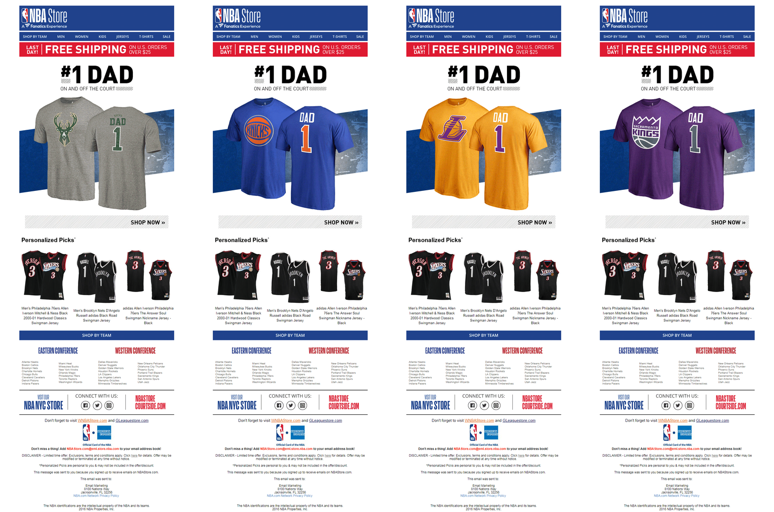
- An interesting animated GIF that catches subscriber attention.
- Personalized Picks that drive relevance and further engagement.
- Includes whitelisting instructions and social sharing buttons
- The Text:Image ratio is well maintained.
What may not work
- No preheader text and unsubscribe link.
- The first CTA can be easily missed.
- The footer shows 2016 as the copyright year. It may throw off those folks who pay attention to those minute details.
Busted Tees

Thumbs Up
- The offer highlighted in the hero image can work well in bringing more conversions.
- The brand has used interesting copy even in the Unsubscribe link.
What may not work
- It’s heavy on images. The Text to image ratio is highly skewed.
- The CTAs are not as well-defined as they could be.
- While scrolling isn’t a sin anymore, this email may be too long and be trying to fit too much content (it’s always worth a test).
Ferns N Petals

Thumbs Up
- The headline with the hashtag in the hero image looks attractive.
- Enticing images increase the chance of conversions.
What may not work
- The length of the email could be a turn off for the subscriber.
- It’s the third Sunday and not the second. That’s a terrible mistake in the footer.
- It’s missing the brand logo – for a non-plain text email, this is a branding mistake
- There are no obvious, clickable CTAs
Mack Weldon
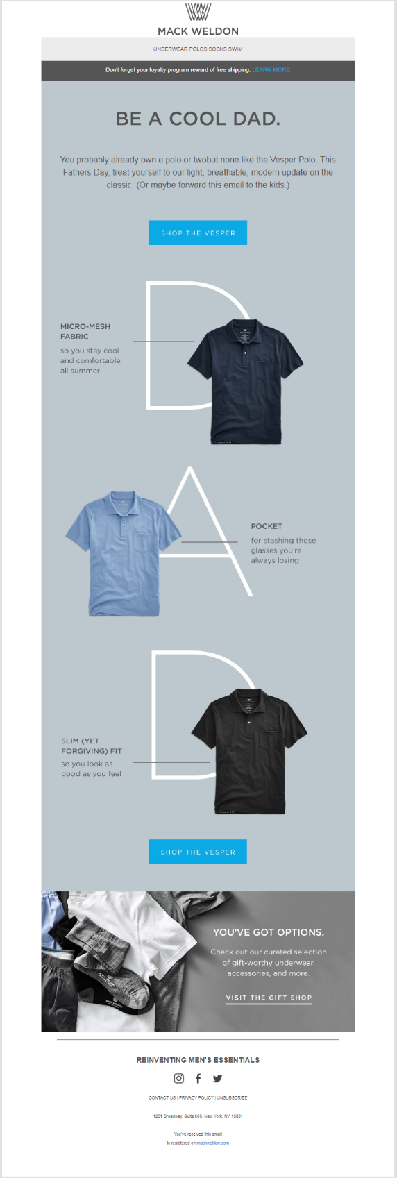
Thumbs Up
- Clean email design that uses ample whitespace
- CTAs are nice and clean.
What may not work
- There may be a bit too much whitespace between the headline and the first paragraph.
- The CTAs may be too spaced apart. The entire email is clickable, which is not necessarily a best practice.
M & Co.

Thumbs Up
- The offer is highlighted in the headline itself.
- The GIFs render a pleasant visual experience.
- The images perfectly match the Father’s Day theme.
What may not work
- The GIFs in the second and third fold may go unnoticed.
- It could get boring to keep scrolling through the email.
Final Thoughts
Solid headlines and captivating imagery can stir Father’s Day emotions. We hope you’ve gleaned some ideas for your Father’s Day campaigns.
If you still need help with Father’s Day campaigns—or your next holiday campaigns—InboxArmy can help you achieve your goals. Contact us now.


